Saturday, November 22, 2008

dorothea lange


I've been going through some of my older sketchbooks lately, and found this drawing I made from a Dorothea Lange photograph. She is my favorite photographer of all time. Her work surprises me every time I see it, and I'm always moved by the work, no matter how many time's I've seen one piece. I am quite parcial to her photos of mothers and children.
I'm going to upload some more excepts from that sketchbook in the future, but heres the Lange drawing.

Tuesday, November 18, 2008

Sunday, November 16, 2008


Today I went to Rite Aid to pick up some odds and ns, is that even how you type that? Odds and Ns? and stumbled upon this album for $4.99. I couldn't say no. It's pretty wonderful.

Saturday, November 15, 2008

David Bailey

A couple of years ago, my brother gave me Ready Steady Go! for my birthday. I finally got around to reading it last winter and would recommend it to anyone with a vague interest in what was happening in London in the 60s.
I could really devote another post to the book, but for now I'd really just like to talk about David Bailey. Actually, I'd just like to share a couple of his portraits that I really love.


The Mick Jagger and Catherine Deneuve have always been two of my favorite portraits, so it was interesting to learn that Bailey'd shot them. The Marianne Faithful is from 1999, and I think it's rather amazing.


Thursday, November 13, 2008

Rem Koolhaas

I've always been fascinated with the mechanics of 20th century architecture.
Walking around Manhattan as a little kid and seeing, I don't know what to call them, "Buildings of the Future", or something; where beams don't touch what they're holding up, or undulating waves are created by bent glass walls of windows, was a wonderful experience.
It's just so compelling to know that human beings daily lives interact with these mammoth works of art.
There's an exhibition at the MoMA now through March 2009 called Dreamland: Architectural Experiments since the 1970s that addresses these Buildings of the Future. I'd really like to go over Thanksgiving break.

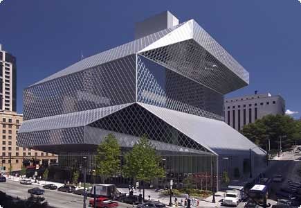
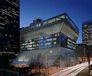
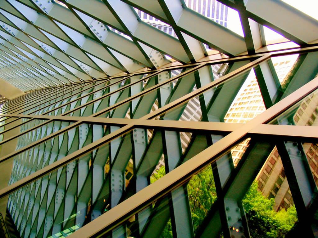
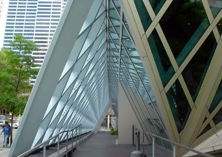
I've been researching Rem Koolhaas.
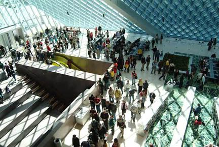
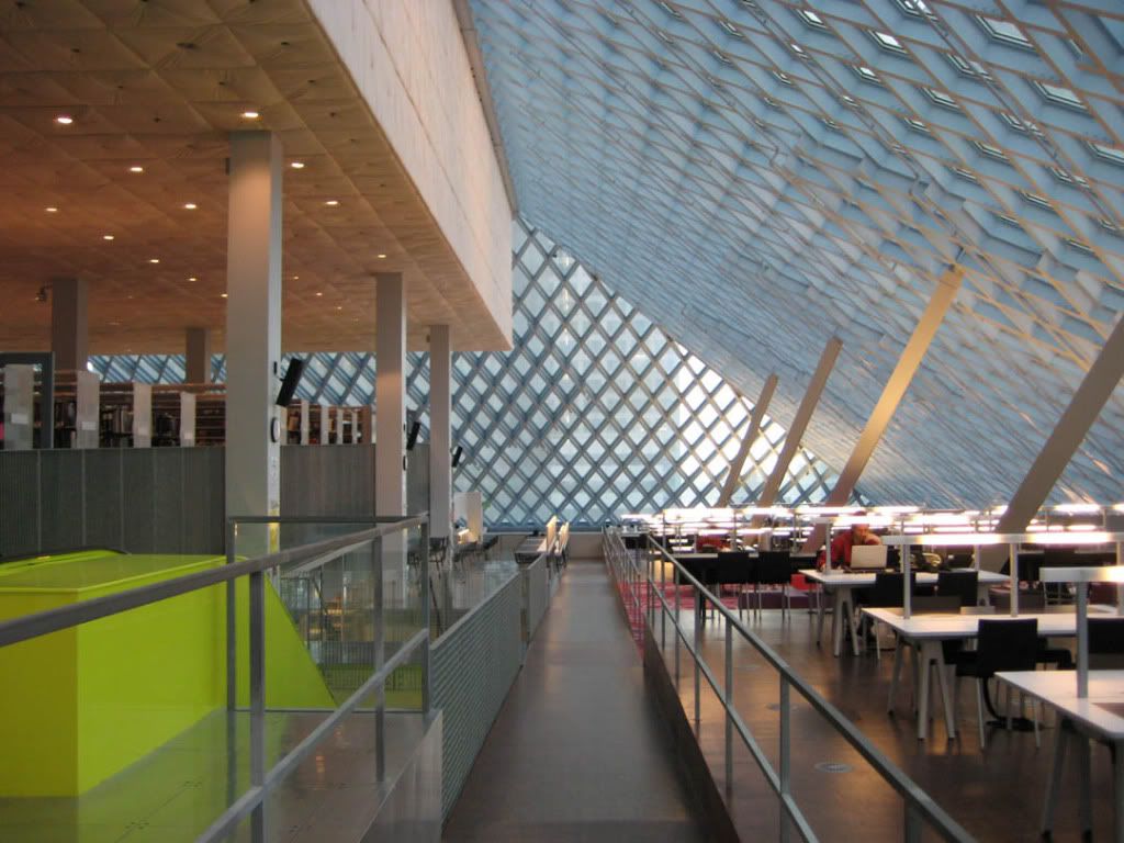
I love the angularity of his buildings and use of repetition of form in many of them. Not only do I like these elements from a design standpoint, but because they help reinforce the idea of strength. Koolhaas's use of light within this angular buildings is particularly engaging. I am most interested in the Seattle Public Library. I hope I get to visit it soon!

Photobucket
Photobucket
Photobucket
Photobucket
Photobucket
Photobucket
Photobucket


I found this to be particularly interesting

Mr. Koolhaas believes in the idea of social progress. The pace of global change leaves him unfazed and optimistic. His work eagerly reforges the broken link between technology and progress. He revels in the unexpected rather than passively anticipating agony. Perhaps as a Dutchman, imprinted with his country's role as an international trading center, he has fewer problems with global change than might someone of another nationality. The Dutch, a nation of traders, have not surprisingly spawned an architect whose work responds to the silent, nanosecond transnational flows of money and ideas.

Mr. Koolhaas also notes the Dutch pride in the national trait of economy and thrift. He actually likes "the integration of the notion of cheapness to create sublime conditions" and is philosophical about "the client as chaos." "Chaos simply happens. You cannot aspire to chaos; you can only be an instrument of it."

— from "Rem Koolhaas, Post-Nationalist Architect", The New York Times, September 11, 1994.

found here

Wednesday, November 12, 2008

Well Deserved Lubalin Post

Since I embarked upon my venture into Graphic Design, I've been predisposed to use Lubalin Graph Book Oblique, for everything.
It's my default font, my baby.

Photobucket

Recently for my Typography I class we've been given the opportunity to research five specific font families.
Perplexed as to which typefaces to choose, I automatically turned to Lubalin Graph. My second choice, was Avant Garde Gothic.
I was surprised to learn that both fonts were designed by Herb Lubalin, one of the founders of the ITC [International Typeface Corporation] and that Lubalin Graph was based off Avant Garde Gothic.

Herb Lubalin did a lot of really interesting design work and art direction in addition type work in the 70s. I was really excited to learn that he made the PBS and Thirteen logos, both of which I've always been thrilled by.
This Tyopgabor has a ton of his work up.

Here are a few things I really love.

Photobucket
Photobucket
Photobucket
Photobucket
Photobucket
Photobucket
Photobucket
Photobucket

Monday, November 10, 2008


I just want to go for a drive and listen to this.

Friday, November 7, 2008

recent-ish work


These aren't fully developed pieces so much as they are working to be part of a whole.

Primarily, my work focuses on the interaction of color and pattern.
Enjoy working methodically to create these forms
especially through the retractive process of cutting away from paper.
I strive to find a rhythm within the pattern to further expand upon.


More Work Soon!

Wednesday, November 5, 2008

YES


we can